Convert Variables to Responsive Units with Varly Webflow App
Webflow designers and developers can use Varly to change pixel-based variables into responsive units.
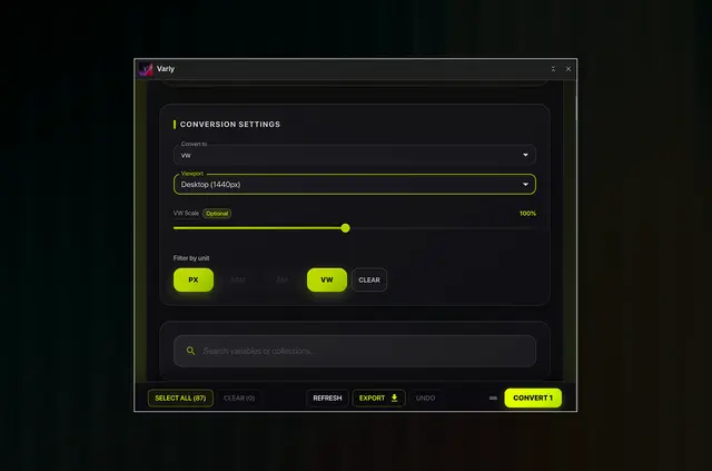
Responsive design work can involve changing spacing, layout, and typography values across a Webflow project. Varly converts pixel-based variables to vw, rem, or em and shows a preview before applying changes.
Made by Eclipso Studio, Varly is listed as free. It is intended for designers and developers managing responsive systems or large variable sets.
Where it fits
Varly suits Webflow projects that use shared variables for spacing, layout, or typography. It can support designers and developers handling responsive systems across desktop, tablet, mobile, and mobile large breakpoints.
What you can do with it
Within a Webflow project, Varly changes variable values between units. For instance, a team can filter for pixel values, choose several variables for batch processing, and review the proposed results before applying them.
Feature notes
- Choose vw, rem, or em as the target unit for pixel-based values.
- Preview the proposed conversion before making project changes.
- Work with desktop, tablet, mobile, and mobile large breakpoints.
- Process multiple variables together in one batch.
- Adjust root sizes, viewport widths, and VW scaling; filter values by units including px, rem, and em.
Questions about Varly
Can Varly process several variables together?
Yes. It supports batch processing for multiple variables.
Can I review a conversion before changing my project?
Yes. Varly displays conversion previews before changes are applied.
Which breakpoints are supported?
Varly supports desktop, tablet, mobile, and mobile large breakpoints.
What settings can I use to control calculations?
Users can set custom root sizes and viewport widths, and adjust VW scaling.
Can I filter variables by their current unit?
Yes. Unit filters help locate values such as px, rem, and em for refactoring.