
Parallax slider Flickity Webflow cloneable
Enhance your Webflow project with a parallax slider using Flickity. This cloneable offers a smooth, interactive carousel for showcasing projects or portfolios. Enjoy responsive design, customizable CSS, and cross-browser compatibility for a captivating user experience.

About cloneable
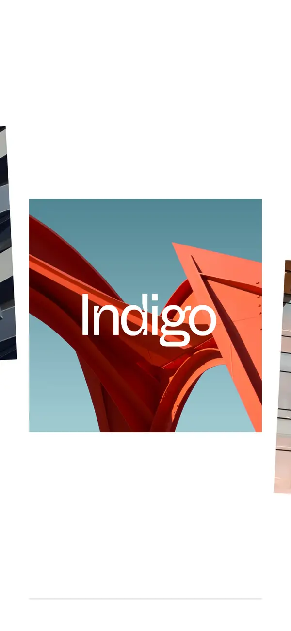
Timothy Ricks has crafted a stunning parallax slider utilizing the Flickity JavaScript library, offering a smooth, interactive experience that can enhance any Webflow project. This cloneable serves as a versatile component that allows users to incorporate a fully responsive carousel into their website seamlessly. The parallax effect, achieved through animated image translations and rotations as users scroll, adds depth and dynamism to visual content, making it perfect for showcasing projects, portfolios, or product displays.
The intuitive design of the carousel encourages engagement by enabling navigation through dragging or arrow keys, providing an accessible user experience. This flexibility can cater to various device types, ensuring that mobile and desktop users alike can enjoy a captivating visual journey.
Developers will appreciate the clean integration of custom CSS and JavaScript, which enables easy customization for different screen sizes. The use of CSS variables supports consistency across color themes, while pointer events management allows for streamlined user interactions. Additionally, the media queries facilitate responsive behavior, providing tailored styling for varied viewport dimensions.
With this cloneable, Webflow users can efficiently implement a polished and visually striking carousel slider on their websites, boosting engagement and aesthetic appeal. Its compatibility with various browsers, ensured by the inclusion of the HTML5 Shiv and Placeholders libraries, enhances the project's reach and functionality in diverse environments. Overall, this parallax slider is a valuable asset for anyone looking to elevate their Webflow site's interactivity and design.
About CSS
What does the CSS code for .flickity-viewport and .flickity-button achieve, especially in a Webflow context?
The .flickity-viewport class is set to be 100% wide and permits overflow with the overflow: visible !important; property. This configuration is essential for ensuring that the content of the Flickity carousel (likely an external library for creating responsive carousels) is displayed without being clipped. The use of !important ensures that this style takes precedence over any other conflicting styles. The .flickity-button class is set to display: none;, effectively hiding the navigation buttons associated with the Flickity carousel in the Webflow design. This can lead to a cleaner user interface but may require the implementation of other navigation controls, if needed.
What are the implications of using CSS variables like --main-dark and --main-light in a Webflow project?
The CSS variables defined as :root { --main-dark: black; --main-light: white; } allow for a centralized management of color themes within the project. By using these variables throughout the CSS, developers can easily implement consistent styling across the entire application. This means if a developer decides to change the theme later, they can do so by updating the variable values in one place. The use of CSS variables is particularly beneficial in Webflow, where styles may be reused across components.
How does the ::selection pseudo-element work in this CSS?
The ::selection pseudo-element allows developers to style the portion of a document that has been highlighted by the user, such as when they click and drag over text. In this CSS, it has been configured to set the background color to var(--main-dark) and the text color to var(--main-light), creating a visually appealing selection style matching the overall color scheme. This enhancement makes the interface feel more personalized and aligned with the site's design. However, it’s important to note that this styling does not apply to images or SVGs, as indicated by img::selection, svg::selection { background: transparent; }.
What is the significance of pointer events in the CSS classes .no-click and .can-click?
The classes .no-click and .can-click utilize the pointer-events property to control user interactions with elements and their children. The .no-click class sets pointer-events: none;, effectively disabling all click actions on the element, meaning it cannot be interacted with by the user. Conversely, the .can-click class sets pointer-events: auto;, allowing the element and its descendants to be interactive. This feature can be especially useful in Webflow for controlling user interactions in dynamic or state-based designs, ensuring that certain elements remain inactive under specific conditions.
**How can a developer target elements based on class name patterns like in [class*="spacer"]?**
The selector [class*="spacer"] in this CSS targets any HTML element that has a class name containing the substring "spacer". This functionality allows developers to apply styles to multiple elements without having to list each class explicitly. In Webflow, where classes can be dynamically generated, this approach streamlines the styling process. For example, it could be employed to introduce spacing or layout adjustments across various layout elements that follow a naming convention, making it a powerful tool for maintaining consistency within a project.
About Javascript
What is Flickity and how is it used in this Webflow JavaScript code?
Flickity is a lightweight JavaScript library that provides a responsive and flickable carousel or slider experience. In this code, Flickity is instantiated with various configuration options that control the behavior of the carousel, like enabling free scroll (allowing users to scroll through slides without snapping), disabling page dots, and setting the cell selector. The .tricks-slider element is passed to Flickity to make the entire element function as a carousel, enhancing the visual layout within a Webflow site.
How does the carousel respond to user scrolling in Webflow?
The carousel in this code responds to user scrolling through an event listener attached to Flickity's scroll event. Whenever the user scrolls, the function setImagePositions() is triggered, which updates the positions of the carousel images based on their progress in the scroll. As users interact with the carousel, they can see animations such as image translation and rotation, creating a parallax effect that makes the carousel visually appealing and dynamic.
What is the purpose of the setImagePositions function in the Webflow slider code?
The setImagePositions function is essential for calculating and applying adjustments to image positions based on the scroll progress of the carousel. It uses the offsets of each slide to determine how far along the user is in the carousel and adjusts the image style properties accordingly. It applies horizontal translation for parallax effects, vertical translation, and rotation to each image within a slide. This enhances the visual interaction design and adds depth to the user experience in a Webflow-based project.
How does the code handle the responsiveness of the slider in Webflow?
The code includes a resize option in the Flickity settings, ensuring that the carousel adapts to changes in screen size or orientation. The setImagePositions() function is called initially to set images' positions correctly when the script loads. This ensures that regardless of the viewport size, the visual elements maintain their intended alignment and effects, contributing to a seamless responsive experience in a Webflow layout.