Figma to Webflow Styleguide Cloneable
Streamline your Webflow projects with the 8xFlow style guide cloneable. Simplify UI design implementation with 8-point spacing and a 12-column layout. Enhance project flexibility with clear naming conventions and Figma integration for efficient design transitions. Improve collaboration and responsiveness with custom CSS and JavaScript features. Elevate your Webflow projects with this invaluable tool.
About cloneable
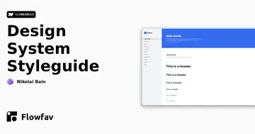
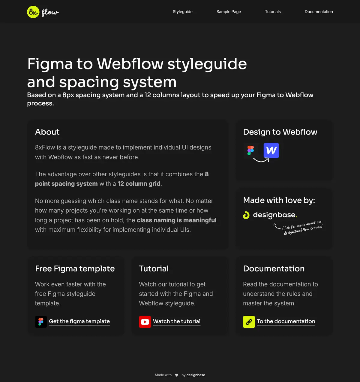
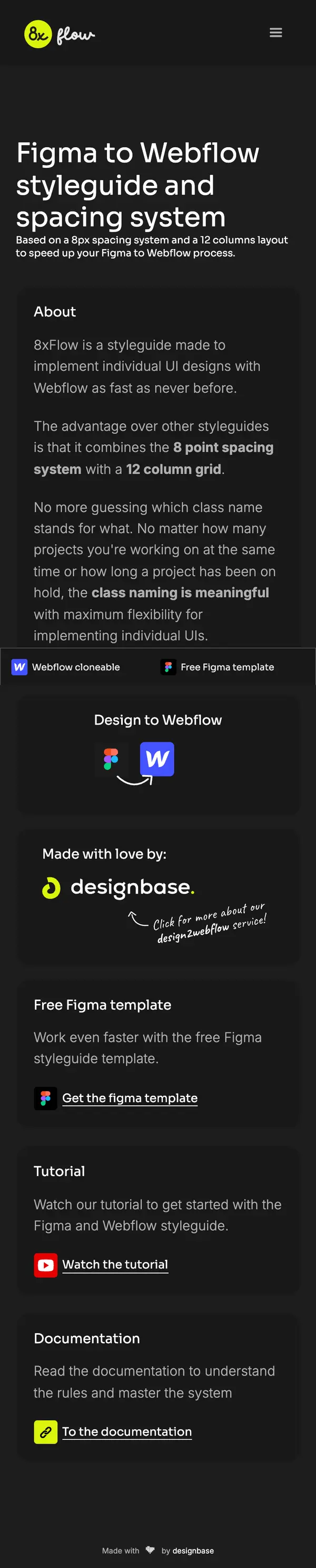
8xFlow is an innovative style guide designed to streamline the implementation of custom UI designs within Webflow. Created by Felix Brodbeck, this resource simplifies the design process by integrating an 8-point spacing system with a 12-column layout. Unlike traditional style guides, 8xFlow eliminates the confusion associated with class names, providing clear, meaningful naming conventions that enhance project flexibility, regardless of the number of ongoing projects or lengthy holds.
With 8xFlow, Webflow users can effortlessly transition from design tools like Figma to their Webflow projects. The included sample page, tutorials, and comprehensive documentation enhance understanding and mastery of the system. By leveraging the Figma style guide template, designers can further increase their efficiency, creating polished, responsive designs faster than ever before.
This cloneable not only promotes consistency across various projects but also significantly reduces the guesswork involved in class naming, making collaboration and project management smoother. Additionally, the inclusion of custom CSS and JavaScript features supports responsive design and improves typography, ensuring that visuals adapt seamlessly across different devices.
Implementing 8xFlow in a Webflow project empowers users to achieve professional-quality results rapidly, enhancing the overall web design experience while enabling them to maintain creative freedom and flexibility. It serves as an invaluable tool for any educator, agency, or freelance designer looking to elevate their Webflow projects with effective, scalable design principles.
About CSS
How does Webflow handle responsive font sizes in CSS?
Webflow allows developers to set responsive font sizes using viewport width (vw) units, as seen in the .body style rule where the font size is set to 1.1111111111111112vw. This means that the font size will dynamically adjust based on the viewport's width. Additional media queries are used to ensure a maximum font size of 16px on screens wider than 1440px and a minimum font size of approximately 11px on screens narrower than 991px. This enables a flexible design that scales with different device sizes.
How can aspect ratios be maintained for images in Webflow?
In this CSS code, aspect ratios for image wrappers are defined using the aspect-ratio property. Classes such as .aspect-ratio-1-1, .aspect-ratio-2-1, and others specify different width-to-height ratios. This enables images to scale properly within their containers while maintaining consistent proportions, enhancing the visual layout across various screen sizes in a Webflow project.